
配置自定义样式功能
来给你的vdoing博客配置一个好看的自定义主题哦……
配置自定义样式功能
版权
警告
本着开源共享、共同学习的精神:
本文是在 《Young Kbt blog》博主文章:《本站 - 自定义样式模块》 基础上增加了一些自己的实际操作记录和修改,内容依旧属于原作者《Young Kbt blog》所有。转载无需和我联系,但请注明文章来源。如果侵权之处,请联系博主进行删除,谢谢~(这里万分感谢原作者的优质文章😜,感谢开源,拥抱开源💖)
正文
NOTE
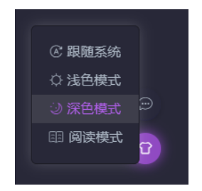
如果你喜欢加粗的 绿色、`` 包裹的 英文高亮 abcd、<mark></mark> 包裹的 文字高亮、深色模式的各种颜色(点击右下角的衣服图标,切换深色模式)等等,那么可以参考下面的文章。
2022-01-01 @Young Kbt

前言
本模块已经提取 Vdoing 主题常用的元素选择器,并写好了注释,方便阅读。
你如果不满意我的颜色样式,想改成自己喜欢的颜色,直接在提取的元素选择器提供 Color 即可。
如果你细心观察,你就会发现本站的一些样式和主题自带的样式有所区别。
在浅色主题,也就是默认主题下,我修改了一些内容:
- 代码块背景色
- 代码块行数颜色
- 代码高亮背景色
- 代码高亮颜色
- 加粗颜色
......
在深色主题下,我修改了一些内容:
- 代码块背景色
- 代码块行数颜色
- 代码高亮背景色
- 代码高亮颜色
- 加粗颜色
- 页面背景色
- 导航栏颜色
- 侧边栏颜色
- 表格背景色
- 表格偶数行颜色
......
如果你喜欢我的一些样式,可以参考下面的代码。
又或者你想定制自己的样式,也可以修改颜色,基本的选择器都已经写好了,只需要更改颜色即可。
样式代码
打开 docs 目录下的 .vuepress 目录下的 style 目录下的 palette.styl 文件,添加如下内容:
详细信息
//***vdoing主题-样式变量***//

// 以下注释的变量仅供参考,主题使用的最新变量请查看:https://github.com/xugaoyi/vuepress-theme-vdoing/blob/master/theme-vdoing/styles/palette.styl
// 你可以在这个文件内修改这些变量的值

// 主题调色板

// 原主题预设变量
// 颜色
// $accentColor = #3eaf7c
// $textColor = #2c3e50
// $borderColor = #eaecef
// $codeBgColor = #282c34
// $arrowBgColor = #ccc
// $badgeTipColor = #42b983
// $badgeWarningColor = darken(#ffe564, 35%)
// $badgeErrorColor = #DA5961
// 布局
// $navbarHeight = 3.6rem
// $sidebarWidth = 20rem
// $contentWidth = 740px
// $homePageWidth = 960px
// 代码块
// $lineNumbersWrapperWidth = 3.5rem


//***vdoing主题-变量***//

// 颜色

$bannerTextColor = #fff // 首页 banner 区(博客标题)文本颜色
$accentColor = #11A8CD
$activeColor = #ff5722
$arrowBgColor = #ccc
$badgeTipColor = #42b983
$badgeWarningColor = darken(#ffe564, 35%)
$badgeErrorColor = #DA5961

// 布局
$navbarHeight = 3.6rem
$sidebarWidth = 18rem
$contentWidth = 860px
$homePageWidth = 1100px
$rightMenuWidth = 230px // 右侧菜单

// 代码块
$lineNumbersWrapperWidth = 2.5rem

// Young Kbt
// 代码块的行数字颜色
div[class*="language-"]
  &.line-numbers-mode
    .line-numbers-wrapper
      color #9e9e9e

// 加粗字体颜色
strong
  // color
  color #00A55A

.suggestions
  max-height 800 px
  overflow-y scroll
.suggestions .highlight
  color #64acff
  font-weight bold

.footer {
  color: #fff;
}

// 解决目录页和标题冲突问题,新版已经解决,这里是旧版的j(2022-4-16)
// .theme-vdoing-content:not(.custom) > h1,
// .theme-vdoing-content:not(.custom) > h2,
// .theme-vdoing-content:not(.custom) > h3,
// .theme-vdoing-content:not(.custom) > h4,
// .theme-vdoing-content:not(.custom) > h5,
// .theme-vdoing-content:not(.custom) > h6 {
//  margin-top: -1.1rem;
//  padding-top: 2.6rem;
// }

.theme-mode-light
  --bodyBg: #f4f4f4
  --mainBg: rgba(255,255,255,1)
  --sidebarBg: rgba(255,255,255,.8)
  --blurBg: rgba(255,255,255,.9)
  --customBlockBg: #fff
  --textColor: #00323c
  --textLightenColor: #d63200     // `` 高亮,原来是 #0085AD
  --borderColor: rgba(0,0,0,.15)
  // 代码块浅色主题
  //--codeBg: #f6f8fa
  //--codeColor: #24292e
  //codeThemeLight()
  // 行高亮颜色,和代码块浅色主题一起使用,一起注释
  //div[class*="language-"]
  //  .highlight-lines
  //    .highlighted
  //      background-color rgba(200,200,200,.4)
  //  &.line-numbers-mode
  //    .highlight-lines .highlighted
  //      &:before
  //        background-color rgba(200,200,200,.4)
  // 代码块深色主题
  --codeBg: #282C34
  --codeColor: #D4D4D4
  codeThemeDark()
  // 行高亮颜色,和代码块深色主题一起使用,一起注释
  div[class*="language-"]
    .highlight-lines
      .highlighted
        background-color rgba(0,0,0,.66)
    &.line-numbers-mode
      .highlight-lines .highlighted
        &:before
          background-color rgba(0,0,0,.66)
  div[class*="language-"].line-numbers-mode::after  // 代码块的行数和内容分割线颜色
    border-right 1px solid rgba(0, 0, 0, 0.66)
   // 下面代码块深色和浅色通用
   // `` 包裹的背景色
  .theme-vdoing-content
    code
      background-color #fff5f5
      //background-color transparent
  // 引用的颜色
  blockquote
    background-color #fdefee
    border-left .25rem solid #e95f59
    padding 10px 16px
    opacity .9
  // 选中代码块的颜色
  pre[class*="language-"]::selection, pre[class*="language-"] ::selection,
  code[class*="language-"]::selection, code[class*="language-"] ::selection {
    text-shadow none
    background-color #0A62C9
  }
  // mark 标签配置
  mark
    color #d63200
    border .1em solid #d63200
    background-color transparent
    padding .1rem .5rem
    border-radius 2rem
    margin 0 .2rem
    font-size .95rem
  // ::: details 的边框
  .custom-block.details
    border solid 1px #ddd

// 深色模式
.theme-mode-dark
  --bodyBg: rgba(40,40,56,1)
  --mainBg: rgba(40,40,56,1)
  --sidebarBg: rgba(40,40,56,.8)
  --blurBg: rgba(40,40,56,.9)
  --customBlockBg: rgba(25,25,49,0.53)
  --textColor: #acb7c4
  --textLightenColor: #b160ea   // `` 包裹的文字颜色
  --borderColor: #1d1d26
  --codeBg: #1d1d26
  --codeColor: #A9B7C6
  codeThemeDark()
  div[class*="language-"].line-numbers-mode::after  // 代码块的行数和内容分割线颜色
    border-right 1px solid rgba(0, 0, 0, 0.66)
  // `` 包裹的背景色
  .theme-vdoing-content
    code
      background-color transparent
  // 引用的颜色
  blockquote
    background-color rgba(25, 25, 49, 0.53)
    border-left .25rem solid #904ac2
    padding 10px 16px
  // 首页每一个模块的边框
  .card-box
    border-radius: 5px;
    background var(--mainBg);
    box-shadow 0 2px 10px 0 rgba(0,0,0,.20);
    transition box-shadow 0.5s;
  .card-box:hover
    box-shadow 2px 2px 15px 2px rgba(0,0,0,.40);
  // mark 标签配置
  mark
    color #b160ea
    border .1em solid #b160ea
    background-color transparent
    padding .1rem .5rem
    border-radius 2rem
    margin 0 .2rem
    font-size .95rem
  // 表格的样式
  table
    border-color #1d1d26
    thead
      background-color #2c2c47
      font-size 1.02rem
  tr:nth-child(2n)
    background-color #2c2c47
  // 信息框容器颜色
  .custom-block.tip,
  .custom-block.warning,
  .custom-block.danger,
  .custom-block.note
    background-color rgba(25,25,49,0.53)
  .custom-block.danger
    color #ff4545
    .custom-block-title
      color #ff4545
  .custom-block.note
    color #28a1de
  // 鼠标悬停、a 标签颜色,主题默认颜色 #11a8cd
  .nav-item > a:not(.external):hover,
  .nav-item > a:not(.external).router-link-active,
  .nav-item .dropdown-title a:hover,    // 导航栏悬停
  .nav-item .dropdown-title a.router-link-active,
  .dropdown-wrapper .dropdown-title .title:hover    // 导航栏非 a 标签
    border-bottom 2px solid #b160ea

  a.sidebar-link.active     // 侧边栏当前标题
    color #b160ea
    border-left-color #b160ea

  .post-list .post .title-wrapper a:hover,   // 首页文章列表悬停
  .blogger-wrapper .icons a:hover,     // 首页头像下的图标悬停
  .categories-wrapper .categories a:not(.active):hover,   // 文章分类悬停
  .pagination span:hover,       // 首页的上一页和下一页悬停
  a.sidebar-link:hover,   // 侧边栏悬停
  .right-menu-wrapper .right-menu-content .right-menu-item.active a,  // 文章右侧当前标题
  .right-menu-wrapper .right-menu-content .right-menu-item a:hover,   // 文章右侧标题悬停
  .dropdown-wrapper .nav-dropdown .dropdown-item a:hover,   // 导航栏的二级导航悬停
  .dropdown-wrapper .nav-dropdown .dropdown-item a.router-link-active,   // 导航栏的选中二级导航
  .buttons .button .select-box li.active,    // 当前主题模式
  .buttons .button .select-box li:hover,      // 三个主题模式悬停
  .archives-page .theme-vdoing-wrapper li a:hover,   // 归档列表悬停
  .search-box .suggestions .focused a:hover,   // 搜索框内容鼠标悬停
  .custom-block.details summary:hover     // ::: details 的标题悬停
    color #b160ea

  .categories-wrapper .categories a:not(.active):hover,   // 文章分类悬停
  .right-menu-wrapper .right-menu-content .right-menu-item.active,
  .search-box input:focus   // 搜索框获取焦点
    border-color #b160ea

  .buttons .button:hover      // 右下角三个图标
    background #904ac2
    box-shadow 0 0 15px #904ac2
  .pagination .pagination-list span.active,     // 分页的当前页
  .search-box .suggestions .parent-page-title   // 搜索框的标题
    background #904ac2

  // vuepress-plugin-tabs 插件的背景色
  .tabs-component-tab,
  .tabs-component-panels
    background-color rgba(25,25,49,0.53)
    border none
  // vuepress-plugin-tabs 插件的标题选中颜色
  .tabs-component-tab.is-active
    color #b160ea

// 阅读模式
.theme-mode-read
  --bodyBg: rgb(236,236,204)
  --mainBg: rgba(245,245,213,1)
  --sidebarBg: rgba(245,245,213,.8)
  --blurBg: rgba(245,245,213,.9)
  --customBlockBg: rgb(236,236,204)
  --textColor: #704214
  --textLightenColor: #996633
  --borderColor: rgba(0,0,0,.15)
  --codeBg: #282c34
  --codeColor: #fff
codeThemeDark()插件样式
目前本站使用了 vuepress-plugin-reading-progress 插件,该插件能显示一个页面的进度条(位于顶部的紫色进度条),下面是我用的样式(放在 palette.styl 里):
// 顶部进度条插件
 $readingBgColor = transparent
 $readingZIndex = 1000
 $readingSize = 3px
 $readingProgressColor = #b160ea
$readingProgressImage = none安装这个插件的命令:
yarn add vuepress-plugin-reading-progress然后在 config.js 的 plugins 中,添加如下内容:
module.exports =[
    [
        'reading-progress'
    ]
],启动后就会生效。
说明
自己模板是从大佬开源模板里拿到的,因此以上配置无需配置。
官网部分
主题样式变量
下面是vdoing主题使用的css变量,你可以在.vuepress/styles/palette.styl修改这些变量覆盖它们:
详细信息
//***vdoing主题-CSS变量***//

// 颜色
$bannerTextColor = #fff // 首页banner区(博客标题区)的文本颜色
$accentColor = #11A8CD
$activeColor = #ff5722
$arrowBgColor = #ccc

// 布局
$navbarHeight = 3.6rem
$sidebarWidth = 18rem
$contentWidth = 860px
$homePageWidth = 1100px
$rightMenuWidth = 230px // 右侧菜单

// 代码块
$lineNumbersWrapperWidth = 2.5rem

// 浅色模式
.theme-mode-light
  --bodyBg: #f4f4f4
  --mainBg: rgba(255,255,255,1)
  --sidebarBg: rgba(255,255,255,.8)
  --blurBg: rgba(255,255,255,.9)
  --textColor: #004050
  --textLightenColor: #0085AD
  --borderColor: rgba(0,0,0,.15)
  // 代码块浅色主题
  --codeBg: #f6f6f6
  --codeColor: #525252
  codeThemeLight()
  // 代码块深色主题
  // --codeBg: #252526
  // --codeColor: #fff
  // codeThemeDark()

// 深色模式
.theme-mode-dark
  --bodyBg: rgb(39,39,43)
  --mainBg: rgba(30,30,34,1)
  --sidebarBg: rgba(30,30,34,.8)
  --blurBg: rgba(30,30,34,.8)
  --textColor: rgb(140,140,150)
  --textLightenColor: #0085AD
  --borderColor: #2C2C3A
  --codeBg: #252526
  --codeColor: #fff
  codeThemeDark()

// 阅读模式
.theme-mode-read
  --bodyBg: rgb(240,240,208)
  --mainBg: rgba(245,245,213,1)
  --sidebarBg: rgba(245,245,213,.8)
  --blurBg: rgba(245,245,213,.9)
  --textColor: #004050
  --textLightenColor: #0085AD
  --borderColor: rgba(0,0,0,.15)
  --codeBg: #282c34
  --codeColor: #fff
codeThemeDark()上面的变量值可能不是最新的,最新的变量值可查看:palette.styl(opens new window)
样式修改与适配
当你想修改主题某个地方的样式时,或者你在给博客添加了一些新的模块或插件,发现样式和主题的样式不协调时,都可以在.vuepress/styles/index.styl 添加css样式来做修改。 需要注意的是,你在自己写的css样式中,请尽量使用主题提供的变量来进行适配。
小技巧:当你发现自己写的css样式优先级没有原来的样式高时,可以在样式后面添加
!improtant后缀,使你的样式优先级是最高的。