
时间轴
时间轴
目录
[toc]
版权
次前端项目来源于以下链接,感谢作者的开源文档,感谢。💖
https://www.cnblogs.com/ypppt/p/13340510.html
v1-作者原始版
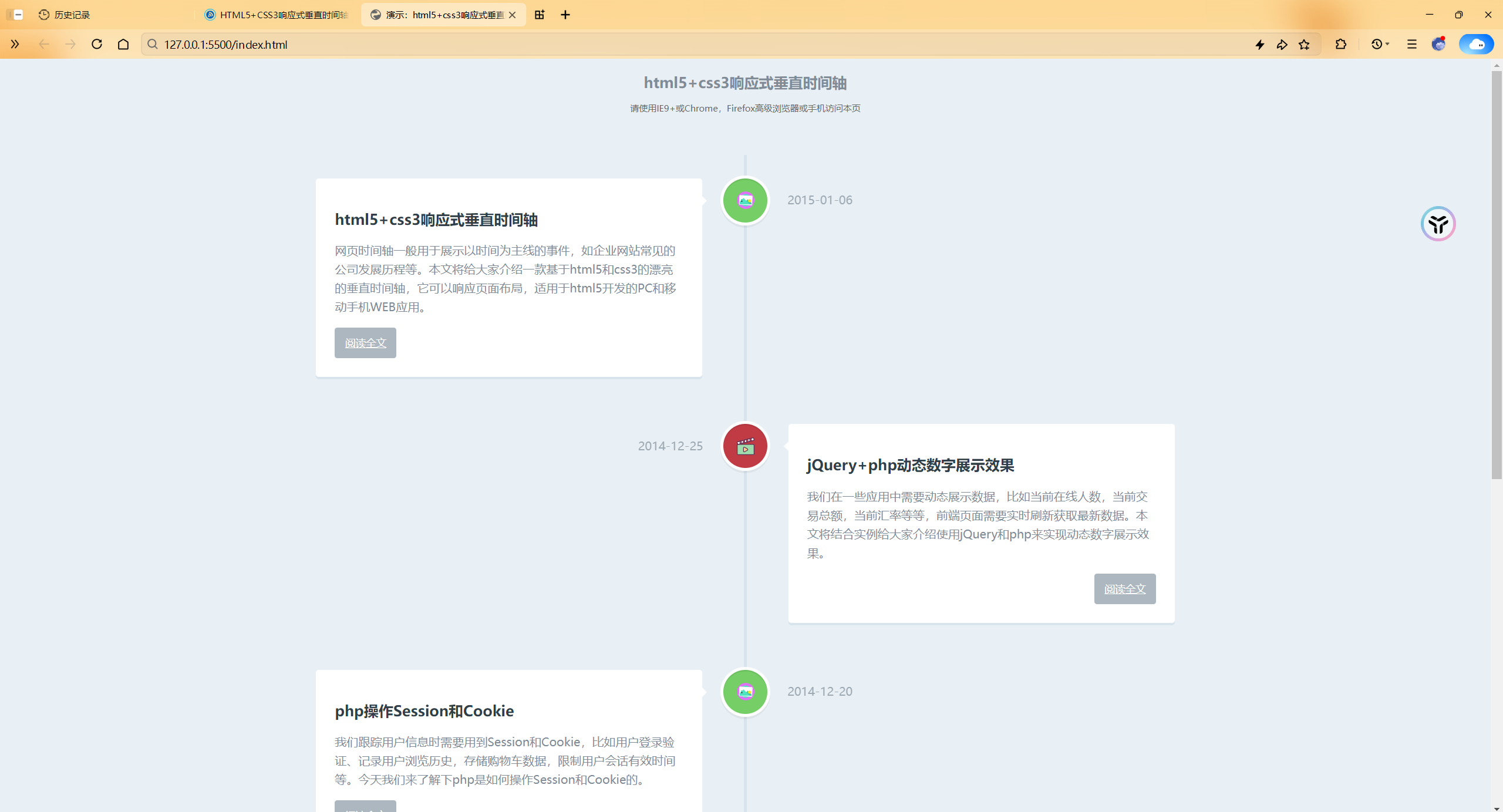
- 效果
- 具体代码
详细信息
html代码:
html
<!DOCTYPE html>
<html>

    <head>
        <meta charset="utf-8">
        <meta name="viewport" content="width=device-width, initial-scale=1.0">
        <title>演示:html5+css3响应式垂直时间轴</title>
        <link rel="stylesheet" href="style.css" />
        <style type="text/css">
            h2.top_title {
                border-bottom: none;
                background: none;
                text-align: center;
                line-height: 32px;
                font-size: 20px
            }

            h2.top_title span {
                font-size: 12px;
                color: #666;
                font-weight: 500
            }
        </style>
    </head>
    <body>
        <h2 class="top_title">html5+css3响应式垂直时间轴<br/><span>请使用IE9+或Chrome,Firefox高级浏览器或手机访问本页</span></h2>
        <section id="cd-timeline" class="cd-container">
            <div class="cd-timeline-block">
                <div class="cd-timeline-img cd-picture">
                    <img src="img/cd-icon-picture.svg" alt="Picture">
                </div>
                <div class="cd-timeline-content">
                    <h2>html5+css3响应式垂直时间轴</h2>
                    <p>网页时间轴一般用于展示以时间为主线的事件,如企业网站常见的公司发展历程等。本文将给大家介绍一款基于html5和css3的漂亮的垂直时间轴,它可以响应页面布局,适用于html5开发的PC和移动手机WEB应用。</p>
                    <a href="#" class="cd-read-more" target="_blank">阅读全文</a>
                    <span class="cd-date">2015-01-06</span>
                </div>
            </div>
            <div class="cd-timeline-block">
                <div class="cd-timeline-img cd-movie">
                    <img src="img/cd-icon-movie.svg" alt="Movie">
                </div>
                <div class="cd-timeline-content">
                    <h2>jQuery+php动态数字展示效果</h2>
                    <p>我们在一些应用中需要动态展示数据,比如当前在线人数,当前交易总额,当前汇率等等,前端页面需要实时刷新获取最新数据。本文将结合实例给大家介绍使用jQuery和php来实现动态数字展示效果。</p>
                    <a href="#" class="cd-read-more" target="_blank">阅读全文</a>
                    <span class="cd-date">2014-12-25</span>
                </div>
            </div>
            <div class="cd-timeline-block">
                <div class="cd-timeline-img cd-picture">
                    <img src="img/cd-icon-picture.svg" alt="Picture">
                </div>
                <div class="cd-timeline-content">
                    <h2>php操作Session和Cookie</h2>
                    <p>我们跟踪用户信息时需要用到Session和Cookie,比如用户登录验证、记录用户浏览历史,存储购物车数据,限制用户会话有效时间等。今天我们来了解下php是如何操作Session和Cookie的。</p>
                    <a href="#" class="cd-read-more" target="_blank">阅读全文</a>
                    <span class="cd-date">2014-12-20</span>
                </div>
            </div>
            <div class="cd-timeline-block">
                <div class="cd-timeline-img cd-movie">
                    <img src="img/cd-icon-movie.svg" alt="Movie">
                </div>
                <div class="cd-timeline-content">
                    <h2>jQuery数字加减插件</h2>
                    <p>我们在网上购物提交订单时,在网页上一般会有一个选择数量的控件,要求买家选择购买商品的件数,开发者会把该控件做成可以通过点击实现加减等微调操作,当然也可以直接输入数字件数。本文将介绍常见的几种使用spinner数字微调器来实现数字加减的功能的方法。</p>
                    <a href="#" class="cd-read-more" target="_blank">阅读全文</a>
                    <span class="cd-date">2014-12-14</span>
                </div>
            </div>
            <div class="cd-timeline-block">
                <div class="cd-timeline-img cd-movie">
                    <img src="img/cd-icon-location.svg" alt="Location">
                </div>
                <div class="cd-timeline-content">
                    <h2>收集整理的非常有用的php函数</h2>
                    <p>项目中经常会需要一些让人头疼的函数,作为开发者应该整理一个自己的函数库,在需要之时复制过来即可。本文作者收集整理数十个php项目中常用的函数,保证能正常运行,你只要复制粘贴到你项目中即可。</p>
                    <a href="#" class="cd-read-more" target="_blank">阅读全文</a>
                    <span class="cd-date">2014-12-05</span>
                </div>
            </div>
        </section>
    </body>
</html>css代码:
css
<style>
    html * {
        -webkit-font-smoothing: antialiased;
        -moz-osx-font-smoothing: grayscale;
    }
    *,*:after,*:before {
        -webkit-box-sizing: border-box;
        -moz-box-sizing: border-box;
        box-sizing: border-box;
    }
    body {
        font-size: 100%;
        color: #7f8c97;
        background-color: #e9f0f5;
    }
    img {
        max-width: 100%;
    }
    /* --------------------------------Modules - reusable parts of our design-------------------------------- */
    .cd-container {
        /* this class is used to give a max-width to the element it is applied to, and center it horizontally when it reaches that max-width */
        width: 90%;
        max-width: 1170px;
        margin: 0 auto;
    }
    .cd-container::after {
        /* clearfix */
        content: '';
        display: table;
        clear: both;
    }
    /* --------------------------------Main components-------------------------------- */
    #cd-timeline {
        position: relative;
        padding: 2em 0;
        margin-top: 2em;
        margin-bottom: 2em;
    }

    #cd-timeline::before {
        /* this is the vertical line */
        content: '';
        position: absolute;
        top: 0;
        left: 18px;
        height: 100%;
        width: 4px;
        background: #d7e4ed;
    }

    @media only screen and (min-width: 1170px) {
        #cd-timeline {
            margin-top: 3em;
            margin-bottom: 3em;
        }
        #cd-timeline::before {
            left: 50%;
            margin-left: -2px;
        }
    }

    .cd-timeline-block {
        position: relative;
        margin: 2em 0;
    }

    .cd-timeline-block:after {
        content: "";
        display: table;
        clear: both;
    }
    .cd-timeline-block:first-child {
        margin-top: 0;
    }
    .cd-timeline-block:last-child {
        margin-bottom: 0;
    }
    @media only screen and (min-width: 1170px) {
        .cd-timeline-block {
            margin: 4em 0;
        }
        .cd-timeline-block:first-child {
            margin-top: 0;
        }
        .cd-timeline-block:last-child {
            margin-bottom: 0;
        }
    }
    .cd-timeline-img {
        position: absolute;
        top: 0;
        left: 0;
        width: 40px;
        height: 40px;
        border-radius: 50%;
        box-shadow: 0 0 0 4px white, inset 0 2px 0 rgba(0, 0, 0, 0.08), 0 3px 0 4px rgba(0, 0, 0, 0.05);
    }
    .cd-timeline-img img {
        display: block;
        width: 24px;
        height: 24px;
        position: relative;
        left: 50%;
        top: 50%;
        margin-left: -12px;
        margin-top: -12px;
    }
    .cd-timeline-img.cd-picture {
        background: #75ce66;
    }
    .cd-timeline-img.cd-movie {
        background: #c03b44;
    }
    .cd-timeline-img.cd-location {
        background: #f0ca45;
    }
    @media only screen and (min-width: 1170px) {
        .cd-timeline-img {
            width: 60px;
            height: 60px;
            left: 50%;
            margin-left: -30px;
            /* Force Hardware Acceleration in WebKit */
            -webkit-transform: translateZ(0);
            -webkit-backface-visibility: hidden;
        }
        .cssanimations .cd-timeline-img.is-hidden {
            visibility: hidden;
        }
        .cssanimations .cd-timeline-img.bounce-in {
            visibility: visible;
            -webkit-animation: cd-bounce-1 0.6s;
            -moz-animation: cd-bounce-1 0.6s;
            animation: cd-bounce-1 0.6s;
        }
    }
    .cd-timeline-content {
        position: relative;
        margin-left: 60px;
        background: white;
        border-radius: 0.25em;
        padding: 1em;
        box-shadow: 0 3px 0 #d7e4ed;
    }
    .cd-timeline-content:after {
        content: "";
        display: table;
        clear: both;
    }
    .cd-timeline-content h2 {
        color: #303e49;
    }
    .cd-timeline-content p,.cd-timeline-content .cd-read-more,.cd-timeline-content .cd-date {
        font-size: 13px;
        font-size: 0.8125rem;
    }
    .cd-timeline-content .cd-read-more,.cd-timeline-content .cd-date {
        display: inline-block;
    }
    .cd-timeline-content p {
        margin: 1em 0;
        line-height: 1.6;
    }
    .cd-timeline-content .cd-read-more {
        float: right;
        padding: .8em 1em;
        background: #acb7c0;
        color: white;
        border-radius: 0.25em;
    }
    .no-touch .cd-timeline-content .cd-read-more:hover {
        background-color: #bac4cb;
    }
    a.cd-read-more:hover {
        text-decoration: none;
        background-color: #424242;
    }
    .cd-timeline-content .cd-date {
        float: left;
        padding: .8em 0;
        opacity: .7;
    }
    .cd-timeline-content::before {
        content: '';
        position: absolute;
        top: 16px;
        right: 100%;
        height: 0;
        width: 0;
        border: 7px solid transparent;
        border-right: 7px solid white;
    }
    @media only screen and (min-width: 768px) {
        .cd-timeline-content h2 {
            font-size: 20px;
            font-size: 1.25rem;
        }
        .cd-timeline-content p {
            font-size: 16px;
            font-size: 1rem;
        }
        .cd-timeline-content .cd-read-more,.cd-timeline-content .cd-date {
            font-size: 14px;
            font-size: 0.875rem;
        }
    }

    @media only screen and (min-width: 1170px) {
        .cd-timeline-content {
            margin-left: 0;
            padding: 1.6em;
            width: 45%;
        }
        .cd-timeline-content::before {
            top: 24px;
            left: 100%;
            border-color: transparent;
            border-left-color: white;
        }
        .cd-timeline-content .cd-read-more {
            float: left;
        }
        .cd-timeline-content .cd-date {
            position: absolute;
            width: 100%;
            left: 122%;
            top: 6px;
            font-size: 16px;
            font-size: 1rem;
        }
        .cd-timeline-block:nth-child(even) .cd-timeline-content {
            float: right;
        }
        .cd-timeline-block:nth-child(even) .cd-timeline-content::before {
            top: 24px;
            left: auto;
            right: 100%;
            border-color: transparent;
            border-right-color: white;
        }
        .cd-timeline-block:nth-child(even) .cd-timeline-content .cd-read-more {
            float: right;
        }
        .cd-timeline-block:nth-child(even) .cd-timeline-content .cd-date {
            left: auto;
            right: 122%;
            text-align: right;
        }
        .cssanimations .cd-timeline-content.is-hidden {
            visibility: hidden;
        }
        .cssanimations .cd-timeline-content.bounce-in {
            visibility: visible;
            -webkit-animation: cd-bounce-2 0.6s;
            -moz-animation: cd-bounce-2 0.6s;
            animation: cd-bounce-2 0.6s;
        }
    }
    @media only screen and (min-width: 1170px) {
        /* inverse bounce effect on even content blocks */
        .cssanimations .cd-timeline-block:nth-child(even) .cd-timeline-content.bounce-in {
            -webkit-animation: cd-bounce-2-inverse 0.6s;
            -moz-animation: cd-bounce-2-inverse 0.6s;
            animation: cd-bounce-2-inverse 0.6s;
        }
    }
</style>v2-2025.5.5-个人改进版
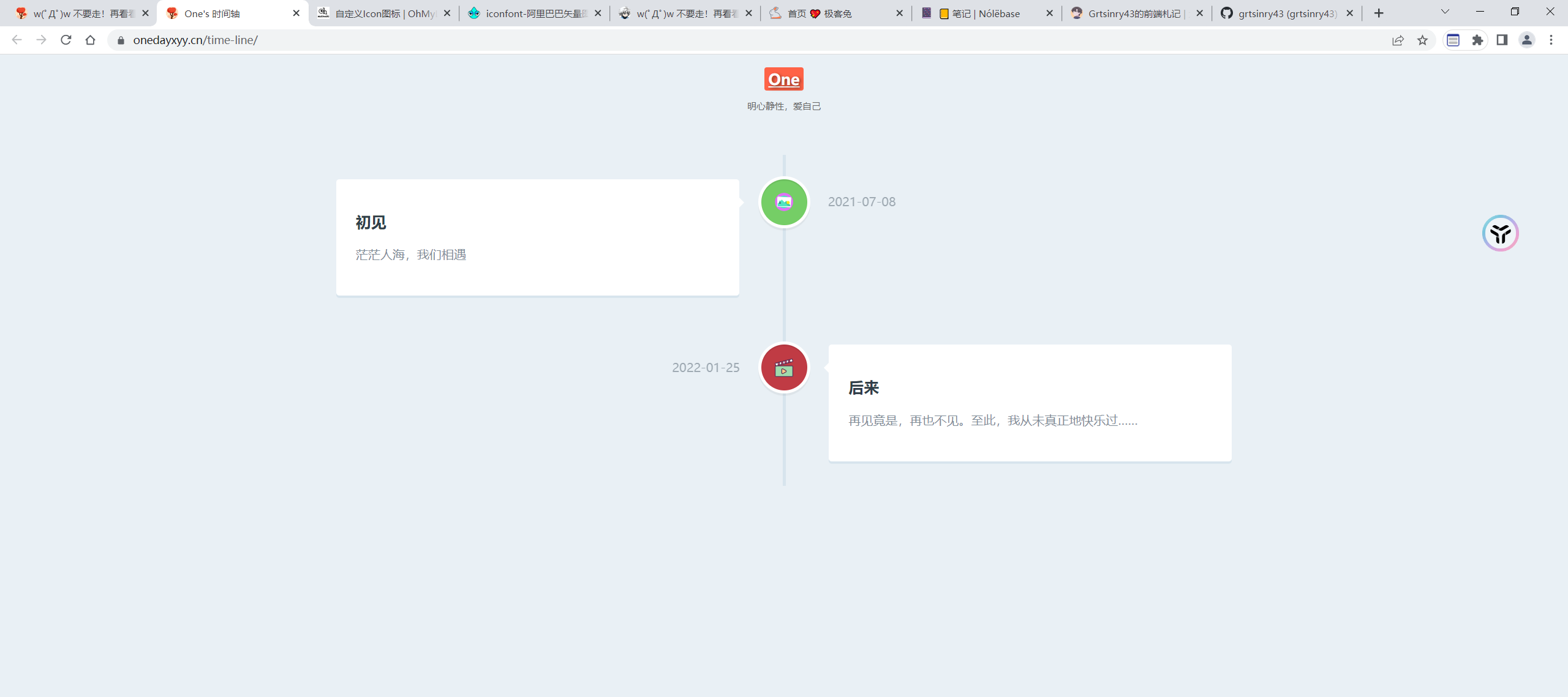
(次项目已部署到自己的Teek博客里了)。
- 去掉阅读全文功能;
- 给标题One添加超链接功能及样式优化;
- 效果
- 代码架构
- 具体代码
详细信息
html代码:
html
<!DOCTYPE html>
<html>
<head>
<meta charset="utf-8">
<meta name="viewport" content="width=device-width, initial-scale=1.0">
<title>One's 时间轴</title>
<link rel="stylesheet" href="style.css" />
<style type="text/css">
h2.top_title {
border-bottom: none;
background: none;
text-align: center;
line-height: 32px;
font-size: 20px;
}
h2.top_title span {
font-size: 12px;
color: #666;
font-weight: 500;
}
</style>
</head>
<body>
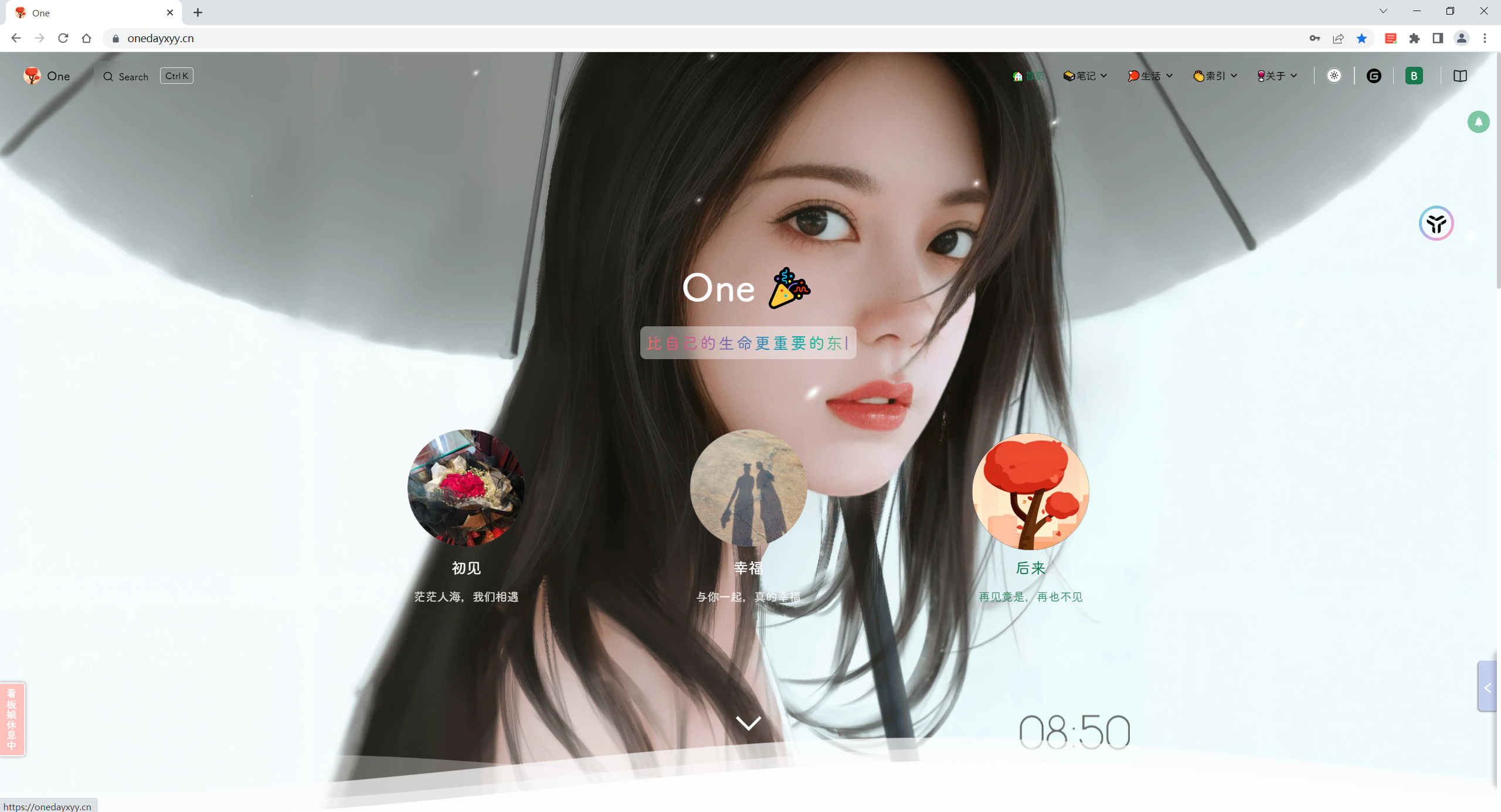
<h2 class="top_title">
<a href="https://onedayxyy.cn/" target="_blank">One</a><br/>
<span>明心静性,爱自己</span>
</h2>
<section id="cd-timeline" class="cd-container">
<div class="cd-timeline-block">
<div class="cd-timeline-img cd-picture">
<img src="img/picture.svg" alt="Picture">
</div>
<div class="cd-timeline-content">
<h2>初见</h2>
<p>茫茫人海,我们相遇</p>
<!-- <a href="#" class="cd-read-more" target="_blank">阅读全文</a> -->
<span class="cd-date">2021-07-08</span>
</div>
</div>
<div class="cd-timeline-block">
<div class="cd-timeline-img cd-movie">
<img src="img/movie.svg" alt="Movie">
</div>
<div class="cd-timeline-content">
<h2>后来</h2>
<p>再见竟是,再也不见。至此,我从未真正地快乐过……</p>
<!-- <a href="#" class="cd-read-more" target="_blank">阅读全文</a> -->
<span class="cd-date">2022-01-25</span>
</div>
</div>
</section>
</body>
</html>css代码:
css
<style>
html * {
-webkit-font-smoothing: antialiased;
-moz-osx-font-smoothing: grayscale;
}
*,*:after,*:before {
-webkit-box-sizing: border-box;
-moz-box-sizing: border-box;
box-sizing: border-box;
}
body {
font-size: 100%;
color: #7f8c97;
background-color: #e9f0f5;
}
img {
max-width: 100%;
}
/* --------------------------------Modules - reusable parts of our design-------------------------------- */
.cd-container {
/* this class is used to give a max-width to the element it is applied to, and center it horizontally when it reaches that max-width */
width: 90%;
max-width: 1170px;
margin: 0 auto;
}
.cd-container::after {
/* clearfix */
content: '';
display: table;
clear: both;
}
/* --------------------------------Main components-------------------------------- */
#cd-timeline {
position: relative;
padding: 2em 0;
margin-top: 2em;
margin-bottom: 2em;
}
#cd-timeline::before {
/* this is the vertical line */
content: '';
position: absolute;
top: 0;
left: 18px;
height: 100%;
width: 4px;
background: #d7e4ed;
}
@media only screen and (min-width: 1170px) {
#cd-timeline {
margin-top: 3em;
margin-bottom: 3em;
}
#cd-timeline::before {
left: 50%;
margin-left: -2px;
}
}
.cd-timeline-block {
position: relative;
margin: 2em 0;
}
.cd-timeline-block:after {
content: "";
display: table;
clear: both;
}
.cd-timeline-block:first-child {
margin-top: 0;
}
.cd-timeline-block:last-child {
margin-bottom: 0;
}
@media only screen and (min-width: 1170px) {
.cd-timeline-block {
margin: 4em 0;
}
.cd-timeline-block:first-child {
margin-top: 0;
}
.cd-timeline-block:last-child {
margin-bottom: 0;
}
}
.cd-timeline-img {
position: absolute;
top: 0;
left: 0;
width: 40px;
height: 40px;
border-radius: 50%;
box-shadow: 0 0 0 4px white, inset 0 2px 0 rgba(0, 0, 0, 0.08), 0 3px 0 4px rgba(0, 0, 0, 0.05);
}
.cd-timeline-img img {
display: block;
width: 24px;
height: 24px;
position: relative;
left: 50%;
top: 50%;
margin-left: -12px;
margin-top: -12px;
}
.cd-timeline-img.cd-picture {
background: #75ce66;
}
.cd-timeline-img.cd-movie {
background: #c03b44;
}
.cd-timeline-img.cd-location {
background: #f0ca45;
}
@media only screen and (min-width: 1170px) {
.cd-timeline-img {
width: 60px;
height: 60px;
left: 50%;
margin-left: -30px;
/* Force Hardware Acceleration in WebKit */
-webkit-transform: translateZ(0);
-webkit-backface-visibility: hidden;
}
.cssanimations .cd-timeline-img.is-hidden {
visibility: hidden;
}
.cssanimations .cd-timeline-img.bounce-in {
visibility: visible;
-webkit-animation: cd-bounce-1 0.6s;
-moz-animation: cd-bounce-1 0.6s;
animation: cd-bounce-1 0.6s;
}
}
.cd-timeline-content {
position: relative;
margin-left: 60px;
background: white;
border-radius: 0.25em;
padding: 1em;
box-shadow: 0 3px 0 #d7e4ed;
}
.cd-timeline-content:after {
content: "";
display: table;
clear: both;
}
.cd-timeline-content h2 {
color: #303e49;
}
.cd-timeline-content p,.cd-timeline-content .cd-read-more,.cd-timeline-content .cd-date {
font-size: 13px;
font-size: 0.8125rem;
}
.cd-timeline-content .cd-read-more,.cd-timeline-content .cd-date {
display: inline-block;
}
.cd-timeline-content p {
margin: 1em 0;
line-height: 1.6;
}
.cd-timeline-content .cd-read-more {
float: right;
padding: .8em 1em;
background: #acb7c0;
color: white;
border-radius: 0.25em;
}
.no-touch .cd-timeline-content .cd-read-more:hover {
background-color: #bac4cb;
}
a.cd-read-more:hover {
text-decoration: none;
background-color: #424242;
}
.cd-timeline-content .cd-date {
float: left;
padding: .8em 0;
opacity: .7;
}
.cd-timeline-content::before {
content: '';
position: absolute;
top: 16px;
right: 100%;
height: 0;
width: 0;
border: 7px solid transparent;
border-right: 7px solid white;
}
@media only screen and (min-width: 768px) {
.cd-timeline-content h2 {
font-size: 20px;
font-size: 1.25rem;
}
.cd-timeline-content p {
font-size: 16px;
font-size: 1rem;
}
.cd-timeline-content .cd-read-more,.cd-timeline-content .cd-date {
font-size: 14px;
font-size: 0.875rem;
}
}
@media only screen and (min-width: 1170px) {
.cd-timeline-content {
margin-left: 0;
padding: 1.6em;
width: 45%;
}
.cd-timeline-content::before {
top: 24px;
left: 100%;
border-color: transparent;
border-left-color: white;
}
.cd-timeline-content .cd-read-more {
float: left;
}
.cd-timeline-content .cd-date {
position: absolute;
width: 100%;
left: 122%;
top: 6px;
font-size: 16px;
font-size: 1rem;
}
.cd-timeline-block:nth-child(even) .cd-timeline-content {
float: right;
}
.cd-timeline-block:nth-child(even) .cd-timeline-content::before {
top: 24px;
left: auto;
right: 100%;
border-color: transparent;
border-right-color: white;
}
.cd-timeline-block:nth-child(even) .cd-timeline-content .cd-read-more {
float: right;
}
.cd-timeline-block:nth-child(even) .cd-timeline-content .cd-date {
left: auto;
right: 122%;
text-align: right;
}
.cssanimations .cd-timeline-content.is-hidden {
visibility: hidden;
}
.cssanimations .cd-timeline-content.bounce-in {
visibility: visible;
-webkit-animation: cd-bounce-2 0.6s;
-moz-animation: cd-bounce-2 0.6s;
animation: cd-bounce-2 0.6s;
}
}
@media only screen and (min-width: 1170px) {
/* inverse bounce effect on even content blocks */
.cssanimations .cd-timeline-block:nth-child(even) .cd-timeline-content.bounce-in {
-webkit-animation: cd-bounce-2-inverse 0.6s;
-moz-animation: cd-bounce-2-inverse 0.6s;
animation: cd-bounce-2-inverse 0.6s;
}
}
h2.top_title {
border-bottom: none;
background: none;
text-align: center;
line-height: 32px;
font-size: 20px;
}
h2.top_title span {
font-size: 12px;
color: #666;
font-weight: 500;
}
h2.top_title a {
color: inherit; /* 继承父元素颜色 */
text-decoration: none; /* 去掉下划线 */
transition: all 0.3s ease; /* 添加过渡效果 */
}
h2.top_title a:hover {
color: #ff6347; /* 悬停时文字颜色变为橙色 */
text-decoration: underline; /* 添加下划线 */
background-color: #ff6347; /* 背景颜色变为橙色 */
color: #fff; /* 文字颜色变为白色 */
padding: 2px 5px; /* 增加内边距 */
border-radius: 3px; /* 圆角效果 */
text-shadow: 2px 2px 4px rgba(0, 0, 0, 0.5); /* 添加阴影 */
transform: rotate(10deg); /* 旋转 10 度 */
animation: bounce 0.5s; /* 播放动画 */
}
@keyframes bounce {
0%, 100% {
transform: translateY(0);
}
50% {
transform: translateY(-5px); /* 上下跳动效果 */
}
}
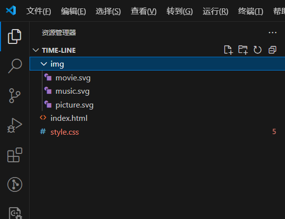
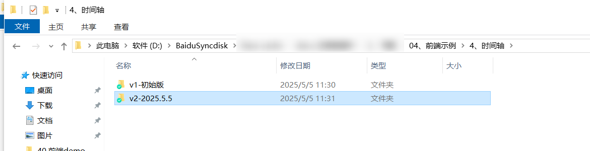
</style>- 源码位置
v2-2025.5.5
关于我
我的博客主旨:
- 排版美观,语言精炼;
- 文档即手册,步骤明细,拒绝埋坑,提供源码;
- 本人实战文档都是亲测成功的,各位小伙伴在实际操作过程中如有什么疑问,可随时联系本人帮您解决问题,让我们一起进步!
🍀 个人网站

🍀 微信二维码
x2675263825 (舍得), qq:2675263825。

🍀 微信公众号
《云原生架构师实战》

🍀 csdn
https://blog.csdn.net/weixin_39246554?spm=1010.2135.3001.5421
🍀 知乎
https://www.zhihu.com/people/foryouone
最后
如果你还有疑惑,可以去我的网站查看更多内容或者联系我帮忙查看。
如果你有更好的方式,评论区留言告诉我。谢谢!
好了,本次就到这里了,感谢大家阅读,最后祝大家生活快乐,每天都过的有意义哦,我们下期见!